/
Time Series Stacked Bar Chart
Time Series Stacked Bar Chart
- Deniz Oğuz
Owned by Deniz Oğuz
This chart adds stacked bars for every tick of X Scale. Stack consist of different values available for the selected Grouping field.
Following example chart is showing all work logs entered by admin user between 01 January 2017 and 30 January 2017. Work logs are grouped by "Project", so this chart is showing how effort of admin user is distributed between different projects in June 2017 in each week.
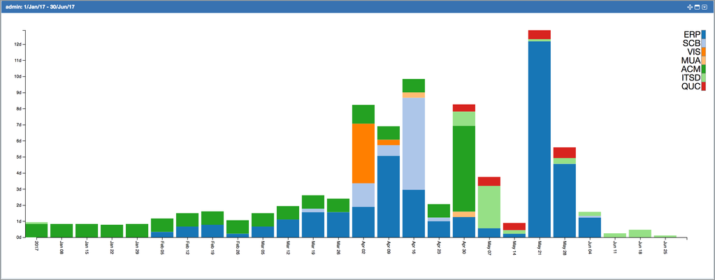
You can switch to tabular display mode and display the data feeding the chart in tabular format by clicking on "Tabular" link at the bottom right of a chart.
, multiple selections available,