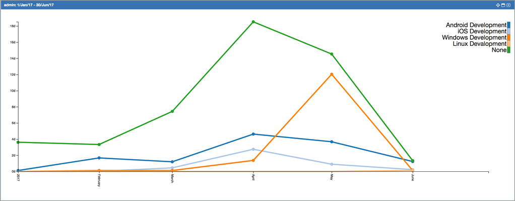
Time Series Line Chart
Following example chart is showing all work logs entered by admin user between 01 June 2017 and 30 June 2017. Work logs are grouped by "Work Type" work log attribute, so this chart is showing how effort of admin user is distributed between different "Work Types" in January 2017.
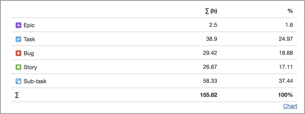
You can switch to tabular display mode and display the data feeding the chart in tabular format by clicking on "Tabular" link at the bottom right of a chart.
, multiple selections available,