Checkbox++
Checkbox++ is a highly configurable single entry Checkbox field that works like toggle switches on iOS or Android applications. You can configure it's on/off text and various UI colors.
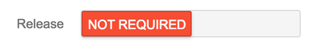
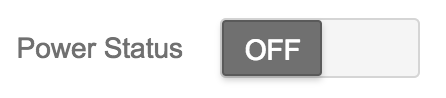
Following are some alternative screenshots using different Checkbox++ configuration.


Configuration
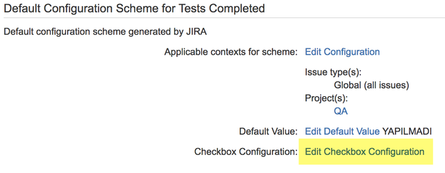
After adding the Checkbox++ field, click on 'Configure' link to open field configuration screen. On the field configuration screen press on 'Edit Checkbox Configuration' highlighted on the below screenshot.
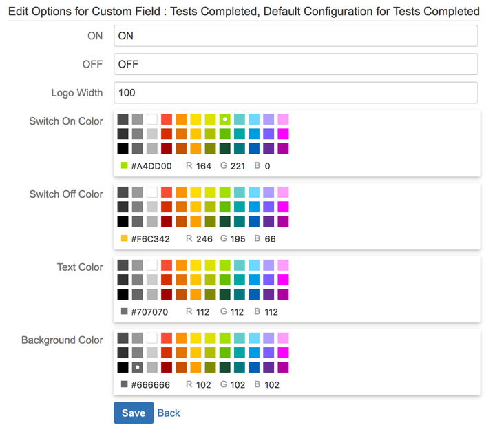
On the newly opened Checkbox Configuration screen you can configure the following properties:
- On Text: Text is displayed when the checkbox is selected. This is also the text displayed on view issue page or on the issue navigator if it is checked. If you use spaces in the text be sure to use non breaking space instead of normal space. Option + Space on Mac or CTRL + Space on Windows.
- Off Text: Text is displayed when the checkbox is not selected. This is also the text displayed on view issue page or on the issue navigator if it is not checked. If you use spaces in the text be sure to use non breaking space instead of normal space. Option + Space on Mac or CTRL + Space on Windows.
- Width: Width of the checkbox field. If you enter a long text for On or Off positions you may need to increase this size.
- Switch On Color: Background color of the switch when it is checked.
- Switch Off Color: Background color of the switch when it is not checked.
- Text Color: Text color of the switch.
- Background Color: Background color of the whole checkbox field.